Contact Creatives
2021 - 2023
Mobile & Web
Creative Marketplace
With a small team, I led the design efforts in refining a scalable web platform and iOS app for creatives and bookers in a rapidly shifting market. Along with fine-tuning our core offering, I shipped a company-wide rebrand and an industry leading early payment feature.

Contact is a B2B SaaS platform for connecting talented creatives with groundbreaking brands. Contact had a strong, core user base but wanted to establish themselves as the go-to platform for booking, managing, and paying creatives. Aligned with these initiatives, they needed an user-centric and accessible user experience.
Contact is a B2B SaaS platform for connecting talented creatives with groundbreaking brands. Contact had a strong, core user base but wanted to establish themselves as the go-to platform for booking, managing, and paying creatives. Aligned with these initiatives, they needed an user-centric and accessible user experience.
Problem
Rebrand
Refit Contact’s visual design language to align with new business objectives.

With a pivot in our core product strategy, our design language no longer fit Contact’s values of a modern, clean SaaS platform. I created a visual treatment that replaced a bolder aesthetic, originally created to represent a trendy, low-key platform. The typeface and visual weighting was revisited, allowing clear and accessible content. I leaned heavily on the stunning visuals from our creatives, and developed a bespoke icon set and colour scheme that was functional, yet didn’t detract from their work. The logo mark better communicated our message, with a slick, continuous graphic that demonstrates connection.
Problem
Rebrand
Refit Contact’s visual design language to align with new business objectives.
With a pivot in our core product strategy, our design language no longer fit Contact’s values of a modern, clean SaaS platform. I created a visual treatment that replaced a bolder aesthetic, originally created to represent a trendy, low-key platform. The typeface and visual weighting was revisited, allowing clear and accessible content. I leaned heavily on the stunning visuals from our creatives, and developed a bespoke icon set and colour scheme that was functional, yet didn’t detract from their work. The logo mark better communicated our message, with a slick, continuous graphic that demonstrates connection.
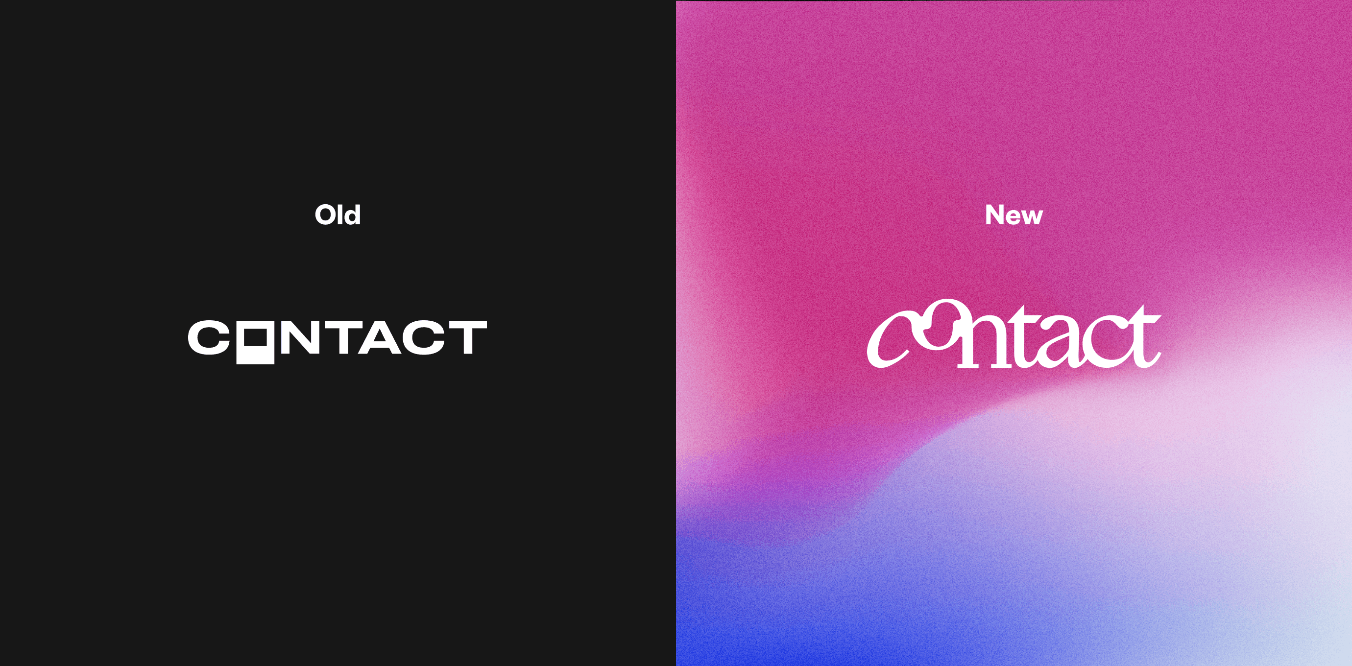
Wordmark before and after. Polaroids are so last year.
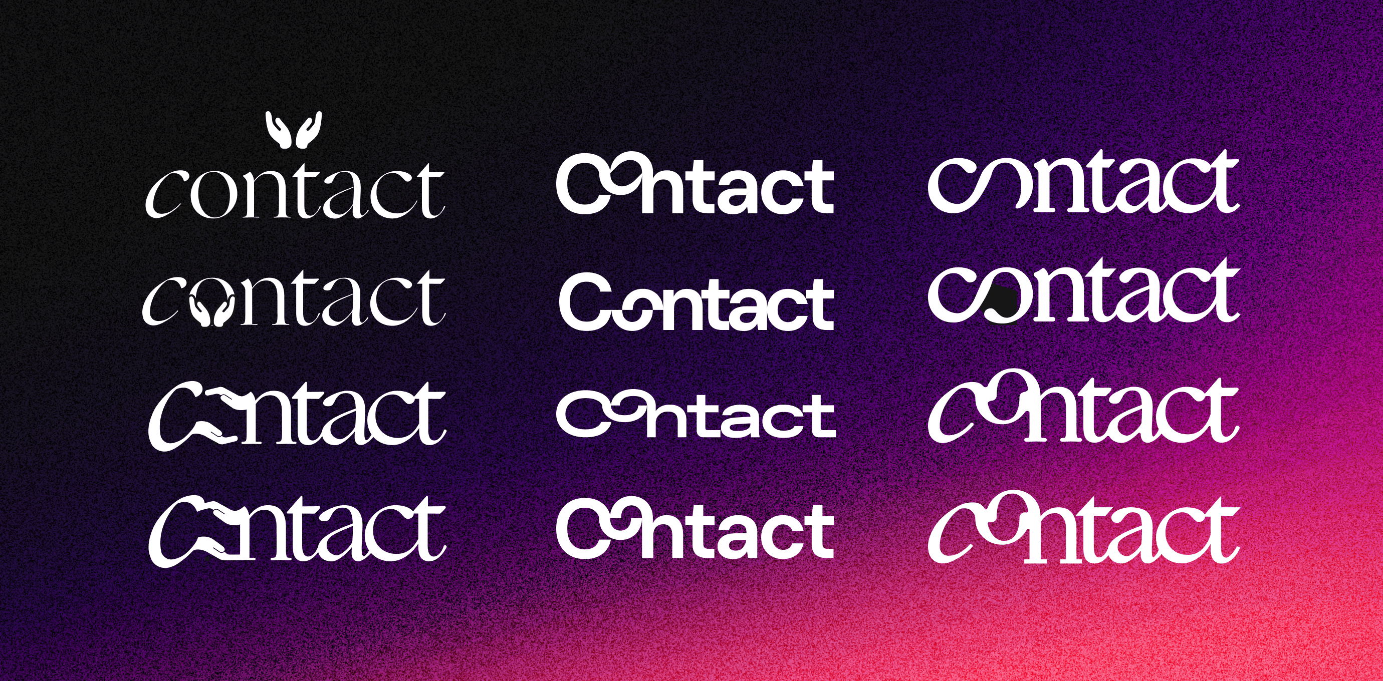
Wordmark early stage evolution
Website landing page
Sign up: Front-loading value proposition keeps account creation clean
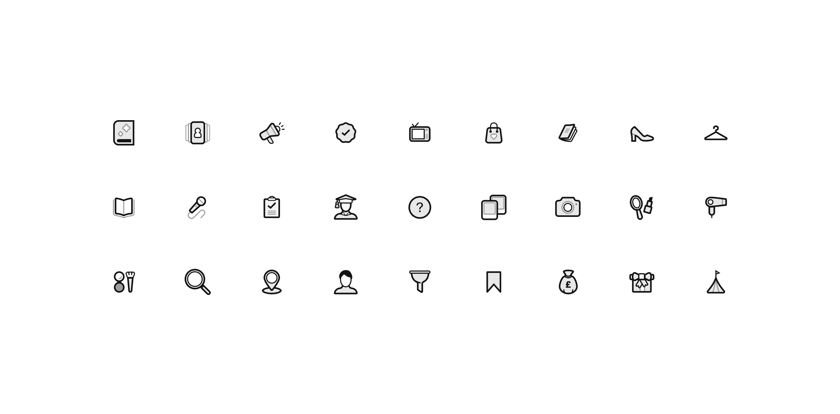
Bespoke icon set for job types and verticals
Problem
Creating a job
Refine our shortlisting and create a job flow to reduce abandonment and improve conversion.
After testing with users, feedback indicated the flow was too long and complicated. The original experience required a shortlist, job details, creative details, and budget submitted in one session. However users rarely have all the information needed until a few days out. To address this, I streamlined the flow by separating shortlisting and job creation, to reduce friction. I introduced a new ‘basket’ (mirroring an e-com experience) for shortlisting, and a simple, one-page form for job details. In a single condensed scroll, with clear progress indicators and autosave, users could revisit the flow as often as required to submit a job without losing progress.
Shortlisting as a standout interaction
All job details as a single, continuous flow
Scrolled state: Dynamic fee calculation and progress indicators
Problem
Creative’s App
Creative’s hired through Contact needed a pocket-size, user-friendly solution for accepting jobs and receiving payment.
As a freelance creative, navigating the gig industry is stressful enough. Aligning with the simplified design language in the rebrand, I crafted a minimal iOS and Android experience giving them the power to manage their profile, incoming jobs, and payments with just a few taps. Complete with FAQs, calendar integration and Contact Bloom (an early payment feature), creatives were empowered to take on more work through Contact with an all-in-one tool.


Results
Feature optimisation led to a 25% increase in booker conversions and a 50% rise in high-value jobs following launch.
Design refinement maxed out our accessibility and SEO scores.
Solely led a company-wide rebrand and created a scaleable design system still in use today.
300% increase in app downloads following revamp.