Cortex
2024
Design System
Matter Neuroscience
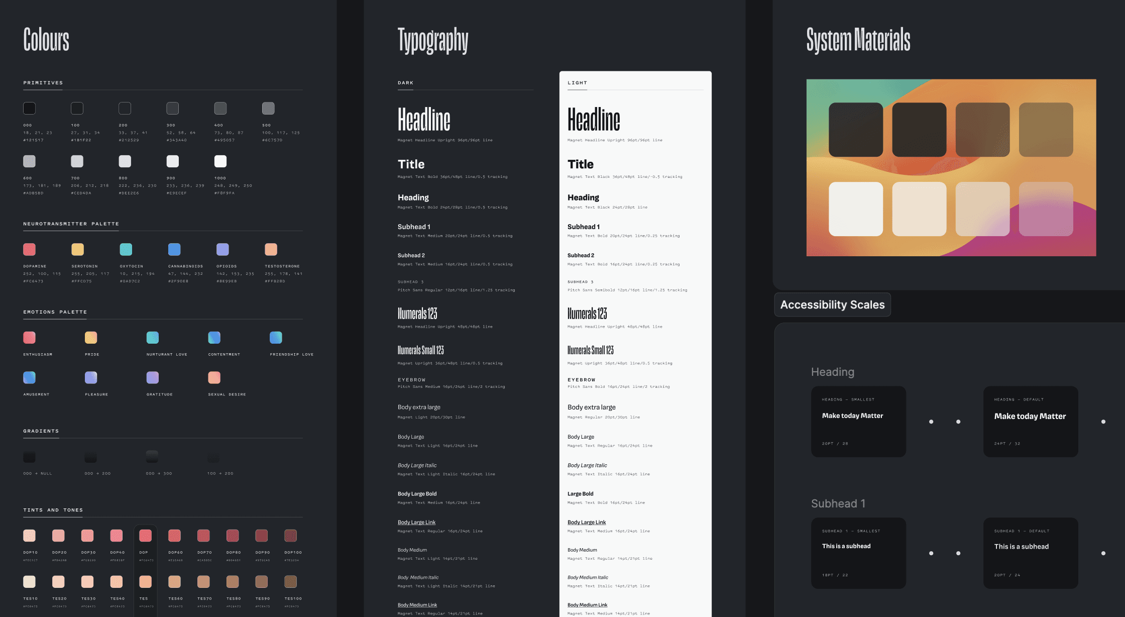
I organised and refined Matter's design assets within a new design system aptly named 'Cortex' (the outer containing layer of grey matter in the brain). I developed an atomic-based component library, social media guidelines, and animation principles to create a cohesive visual identity and streamline the team's workflow.
Challenges
Matter's component library already had a solid foundation pre-alpha, with core brand guidelines defined. However, the new system required a more flexible, scalable library that factored in cross-platform implementation, new features, and brand evolution. Created during development, I had to replace the deprecated library with the new one without blocking engineers or damaging our design files.
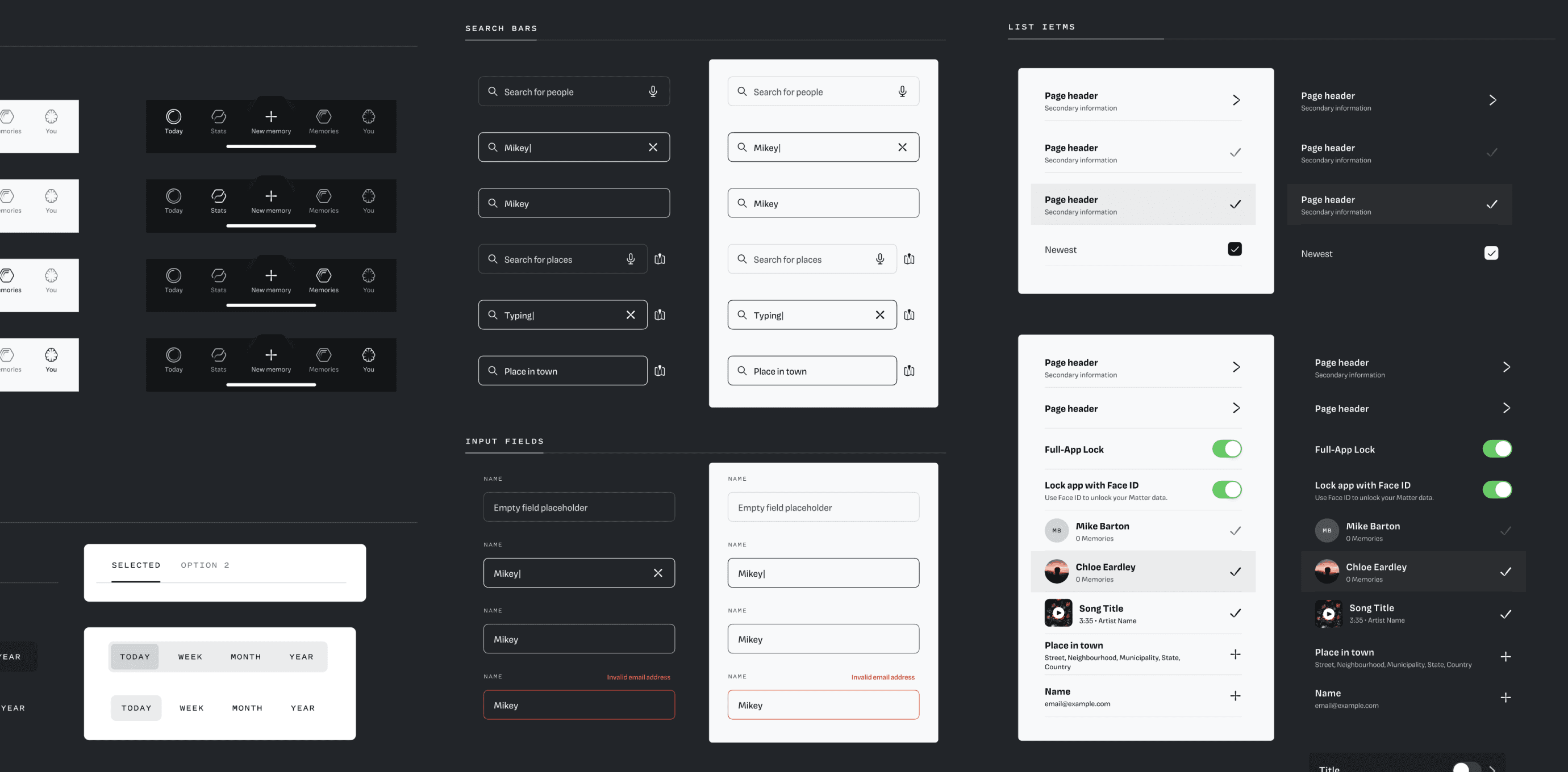
Component library
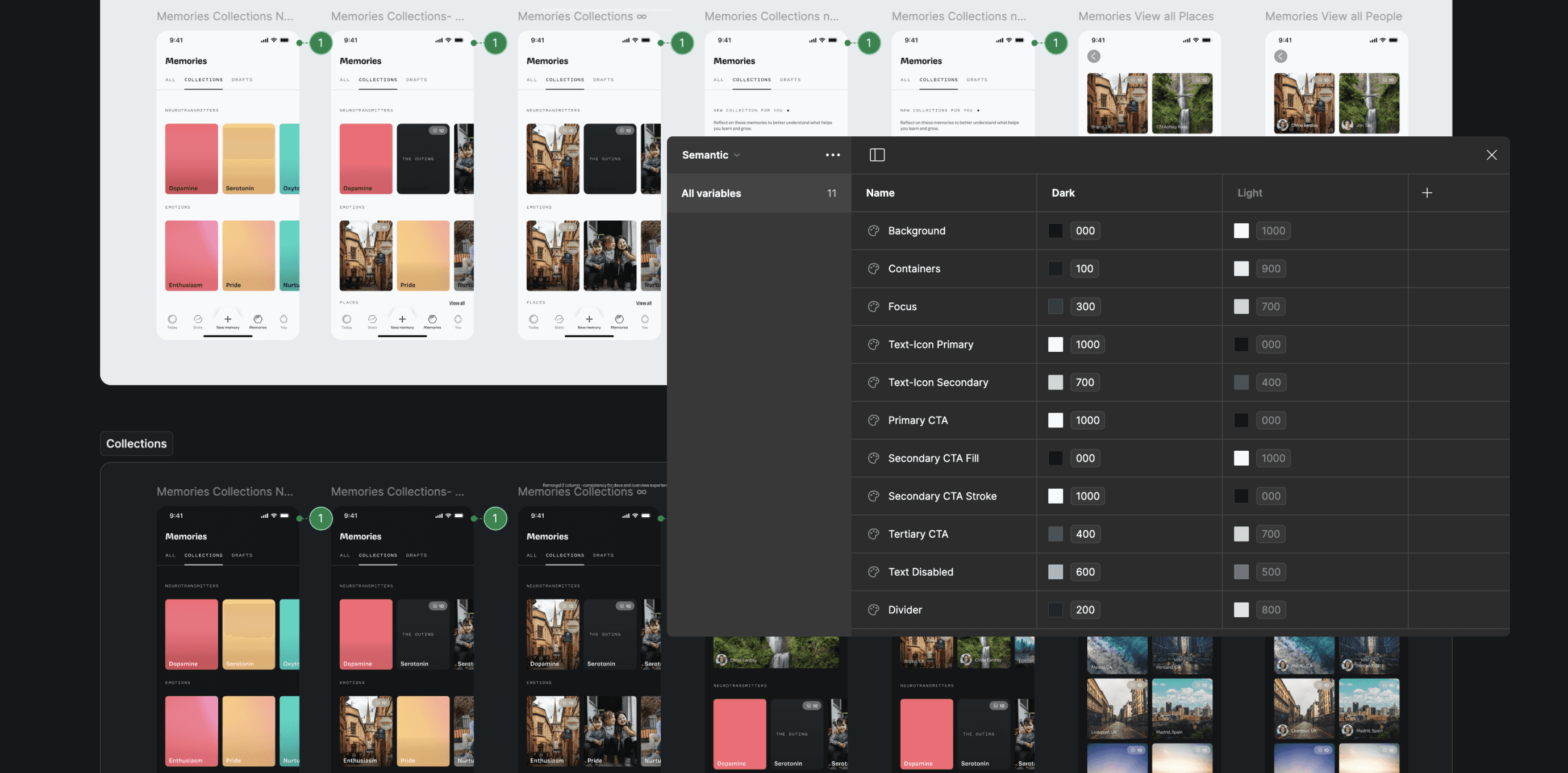
Semantic tokens, allowing quick switching between light and dark mode
Process
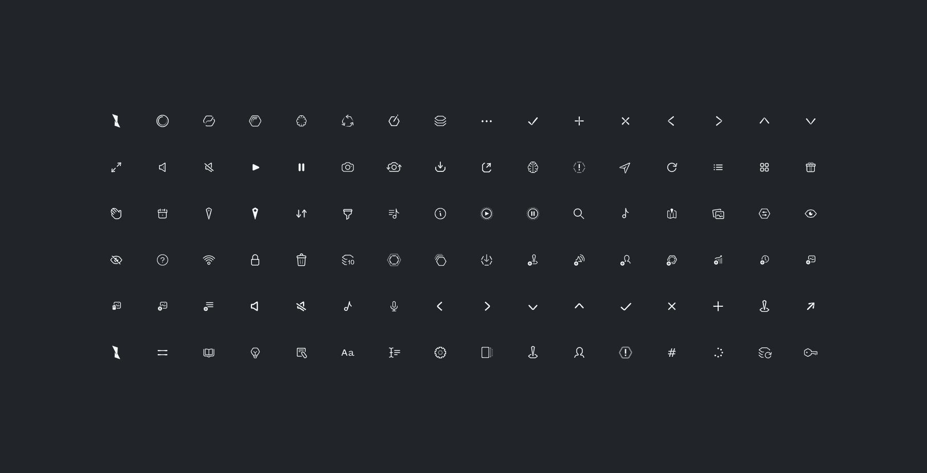
I started by rebuilding our existing assets as reusable, versatile components and established a set of guidelines to ensure new icons and modules stayed on-brand. Once the visual style for onboarding was approved, I created a library of 3D elements with basic particle physics for video use. Custom bezier curves kept transitions and motion graphics visually consistent. Using design tokens, universal variables and an atomic design system (atoms, molecules, and organisms), I could easily adapt on-the-fly tweaks as the product evolved.
Iconography
Outcomes
Streamlining design and development was a success. Recycled components and design tokens aligned with the dev's SwiftUI codebase, enabling easy design handoff. The social media team could post content quickly with a consistent identity, with our brand being solidified via a feature in Times Square. Matter now has strong documentation, libraries, and frameworks to support fast, ongoing development.
Matter feature, Times Square


