Contact Platform
2022
UI/UX, Motion
Contact
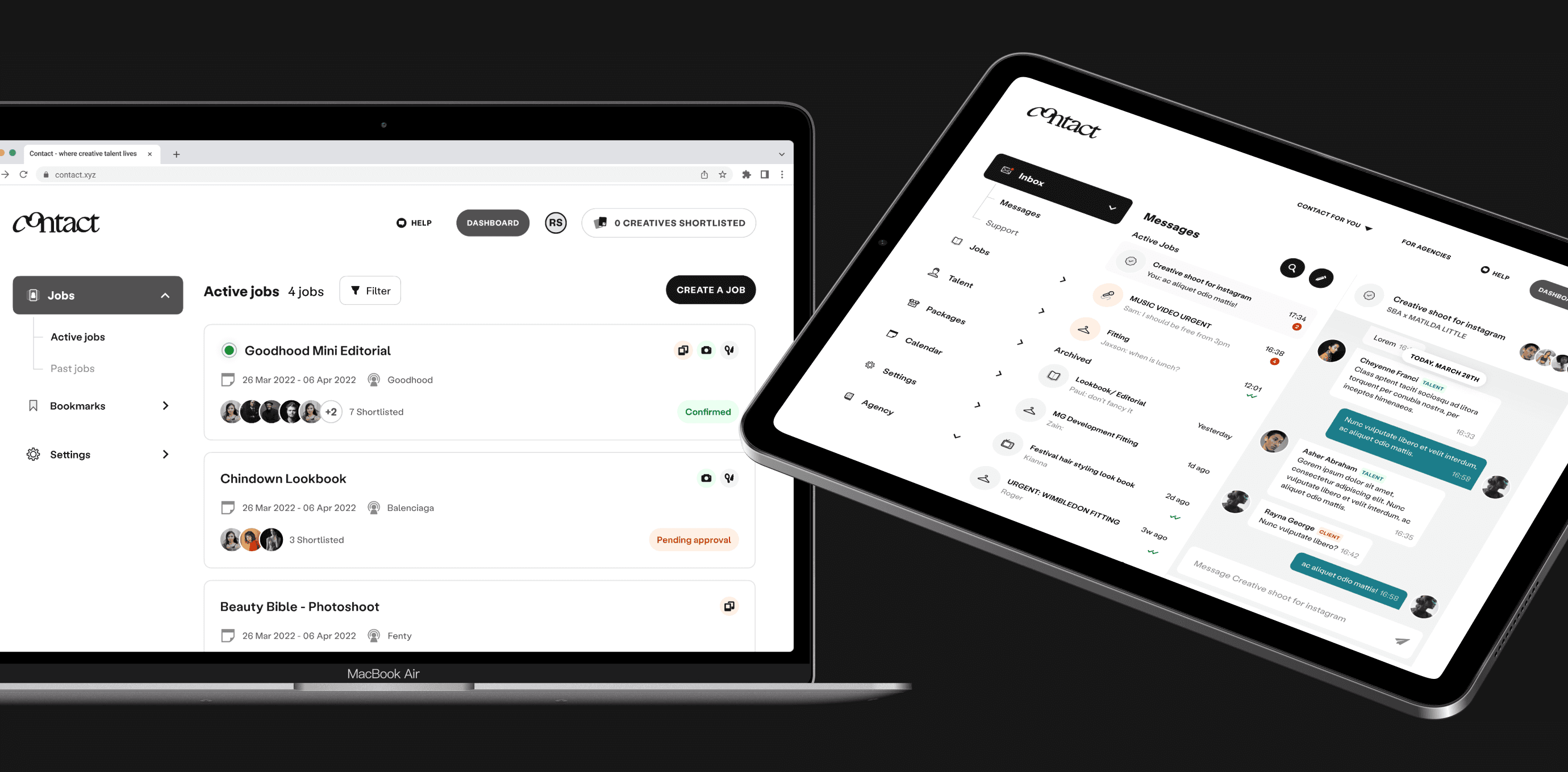
Contact is a B2B platform to discover, manage, book and pay creative talent instantly. I led initiatives to revamp the UI/UX, improving creative shortlisting and agency onboarding, along with other refinements.
Challenges
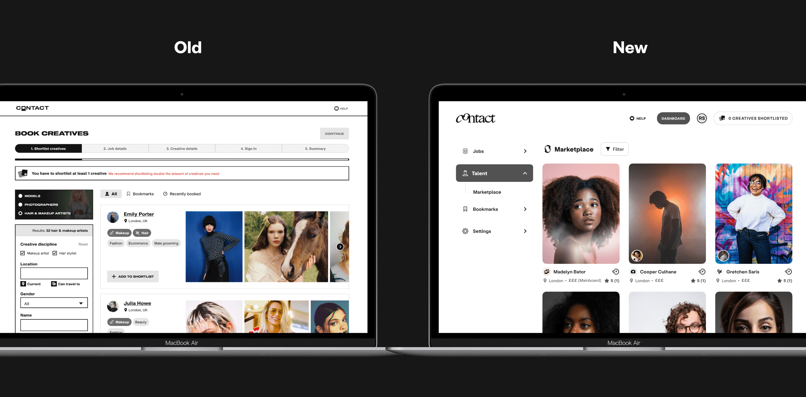
Given Contact’s existing user base, I redesigned the user experience to remain familiar and minimise confusion. New components needed to align with our rebrand and be easy to implement due to our limited development resources. Consistency and clarity for both users and our internal team was high priority.
Before and after, shortlisting
Process
I started with interviews with our bookers and creatives to find major pain points. With these I could wireframe a unified dashboard that grouped all our tools together, adding delight where possible to elevate a fairly straightforward flow. Each design variation went through A/B and MVT testing to ensure the best solution.
Motion highlights
iOS app
Outcomes
Feedback confirmed the redesigned platform was a success; agencies found the new dashboard intuitive, and creatives praised our user-friendly app. The updated page structure not only boosted accessibility and SEO scores, but led to a 25% increase in booker conversions and a 50% rise in high-value jobs.
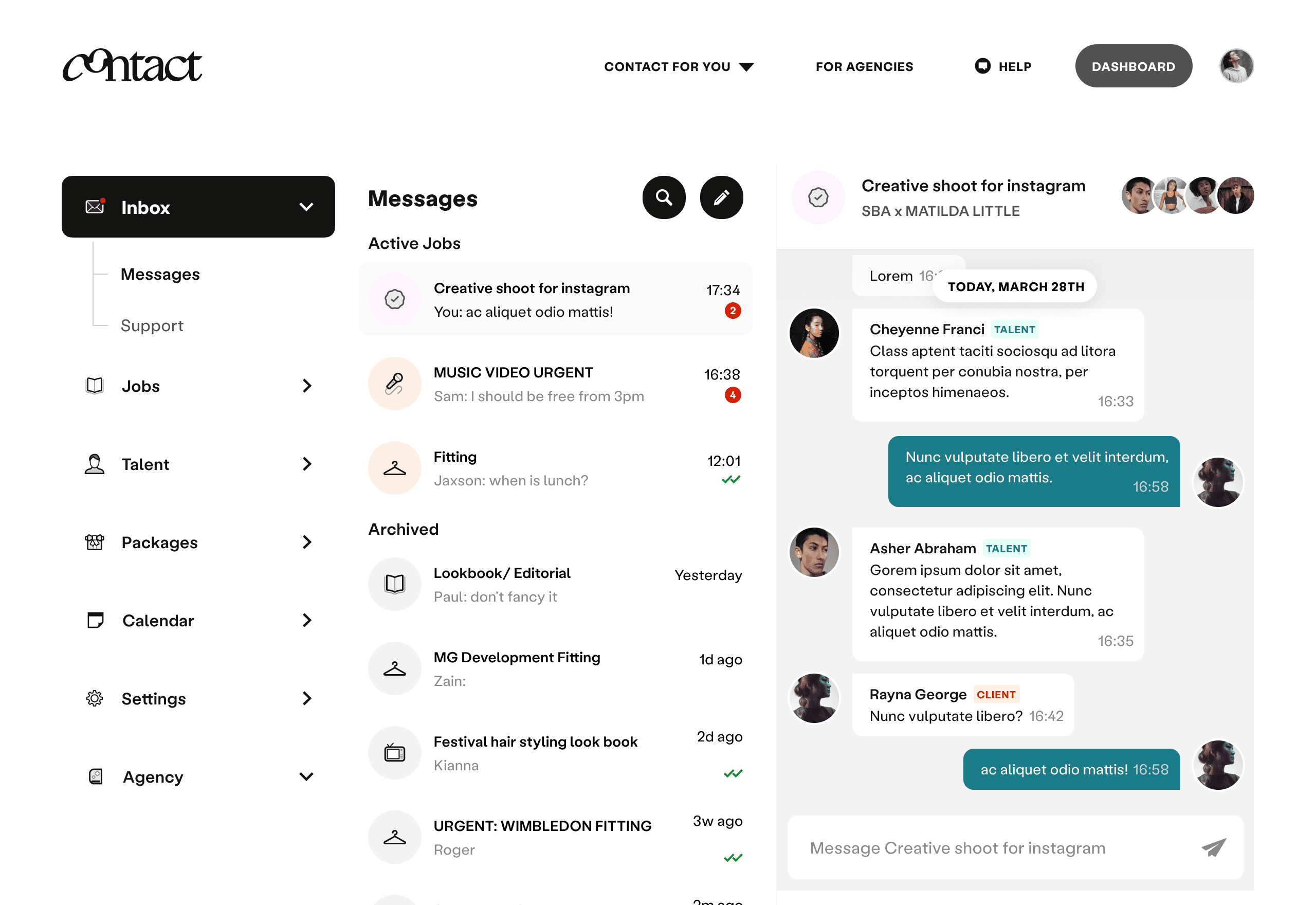
Messaging
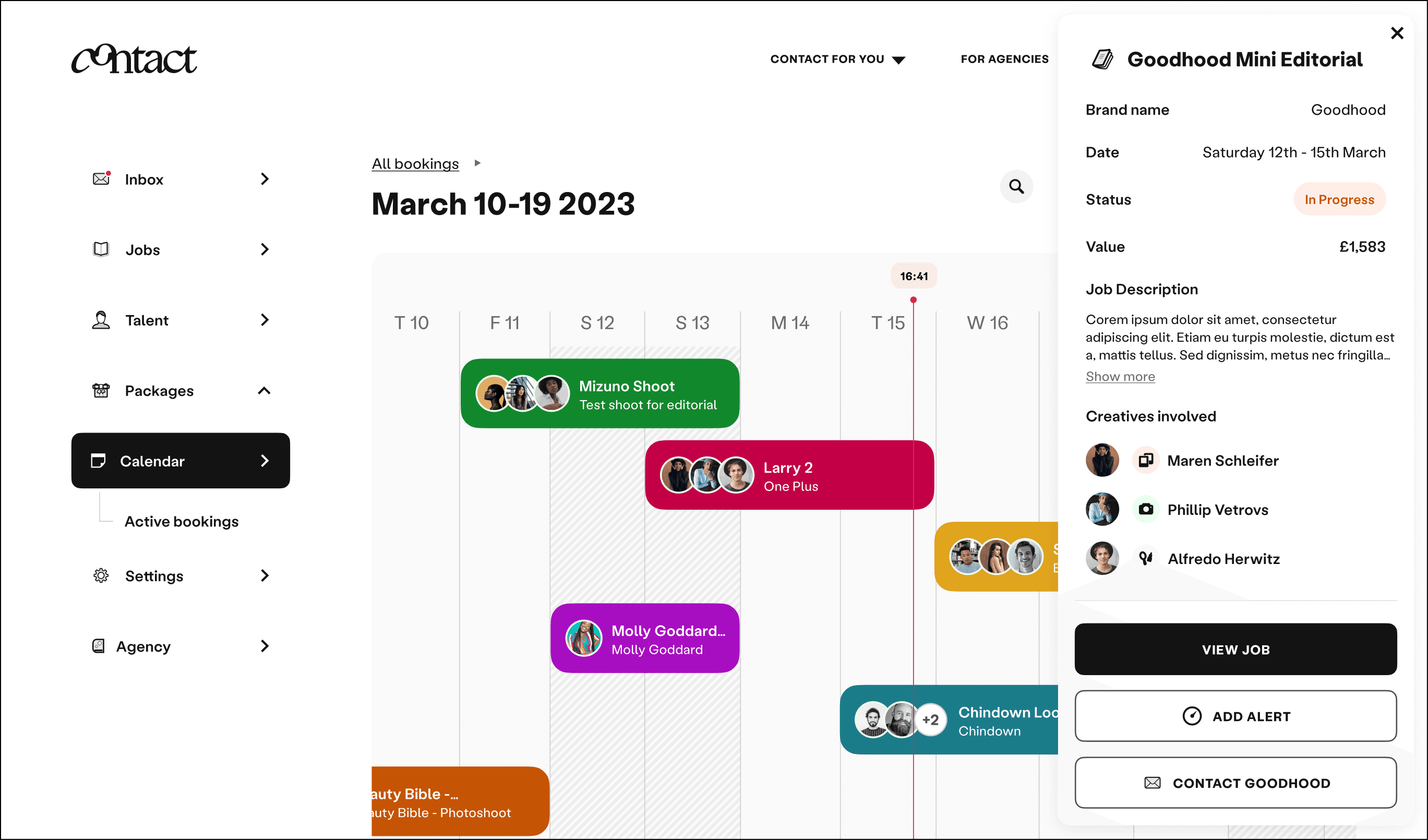
Calendar


