Contact Rebrand
2022
Brand Design
Contact
I spearheaded a company-wide rebrand to closer align the brand with Contact's message - supporting both creatives and agencies as a crossroad between fashion and B2B.
Challenges
The rebrand introduced a new logomark, wordmark, and visual design langauge for both the platform and social media. At the time, Contact was shifting focus to prioritize bookings over talent discovery. The goal was to attract new agencies without alienating existing creatives, who knew the brand well. With a small dev team and limited time, I had to manage scope carefully for the rollout.
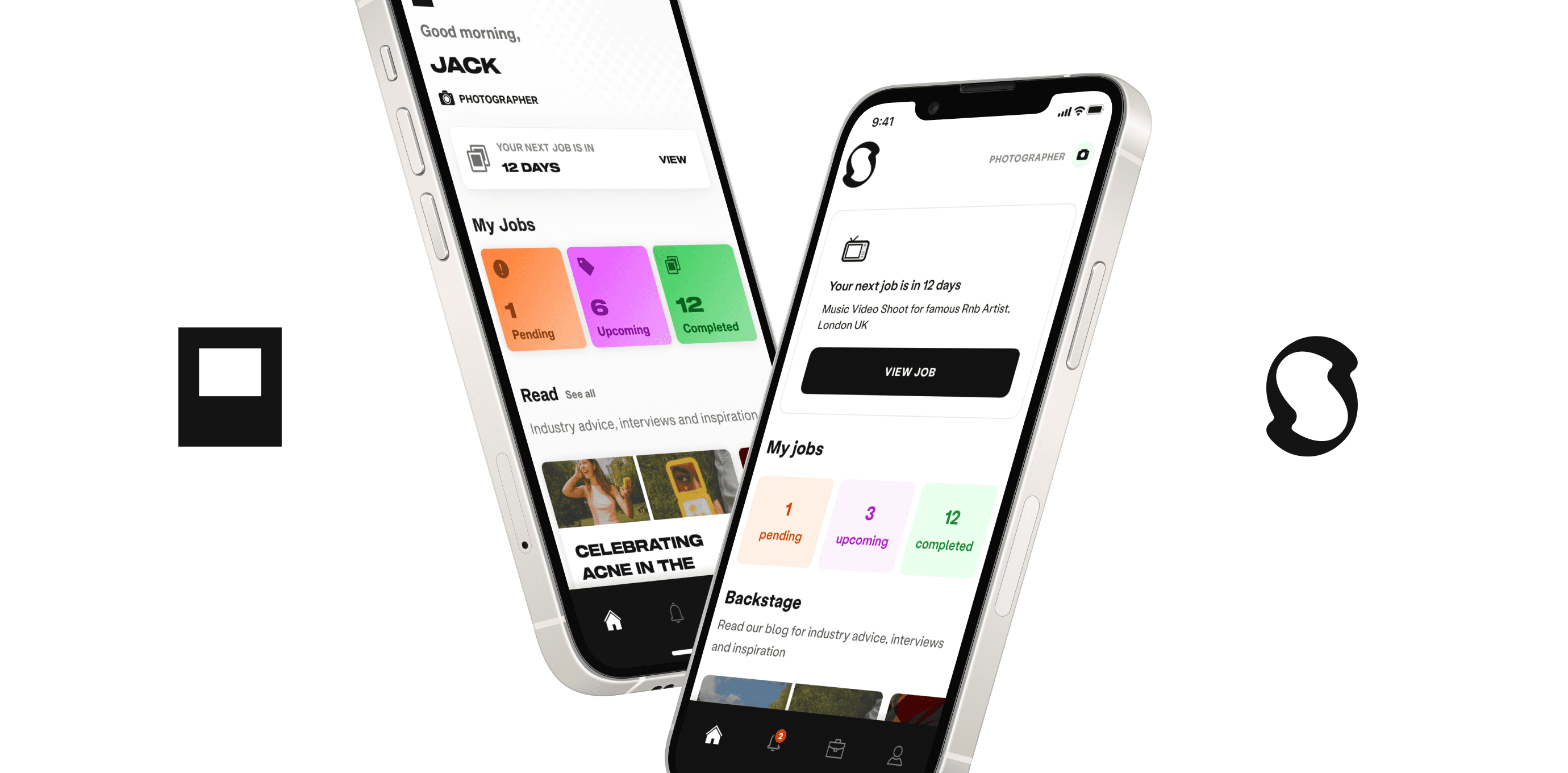
Before and after, iOS
First principles
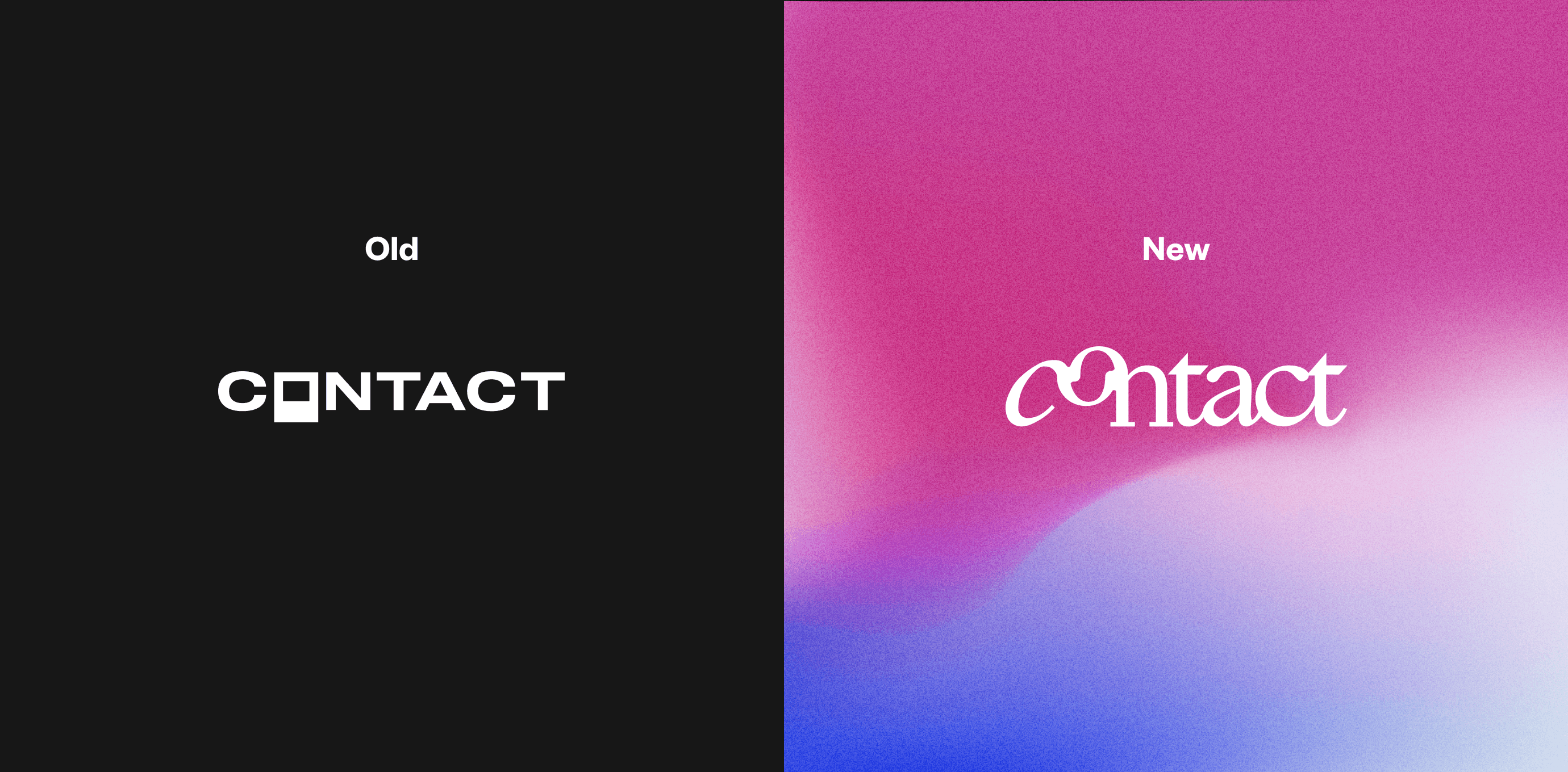
My approach started with user research to address issues with Contact's messaging. Users found the brand's use of all caps, bold colours, and striking imagery intimidating and confusing. The initial brand mark, meant to resemble a polaroid, was ambiguous and restrictive. I intentionally stripped back the UI to highlight the quality of our client's imagery, creating clean components and colours for accessibility. The new logomark I designed reflects connecting users and bookers through a smooth, continuous link.
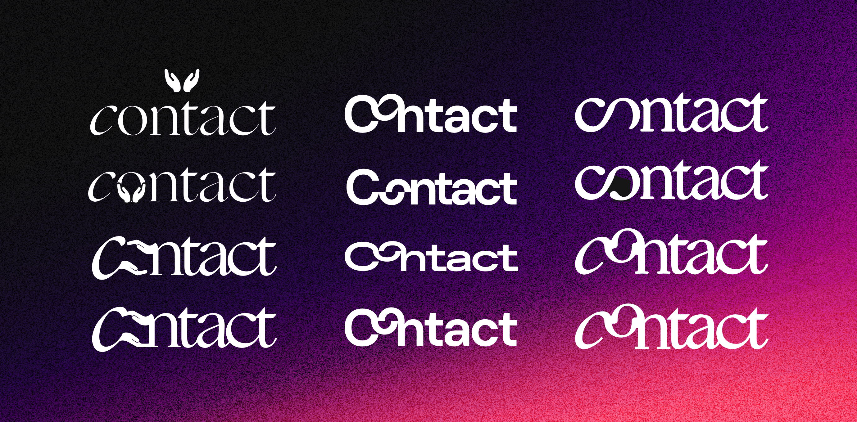
Wordmark variations
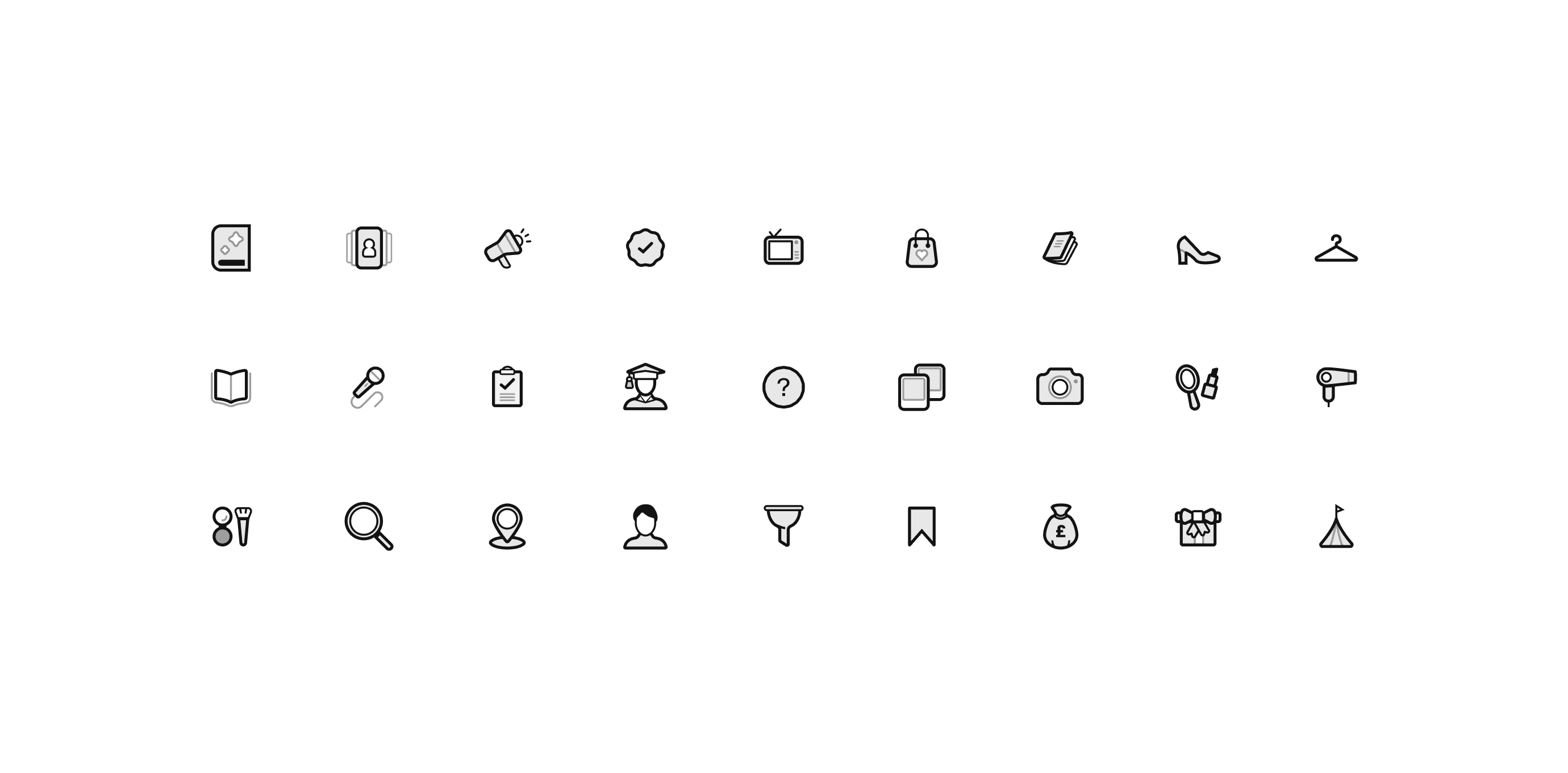
Iconography
Outcomes
Contact's core design language needed refinement, not a complete overhaul. This meant creating a fine-tuned aesthetic with clear guidelines as opposed to full messaging change. Keeping scope to a minimum, our small dev team were able to deliver the refit successfully. User feedback confirmed the rebrand's success.
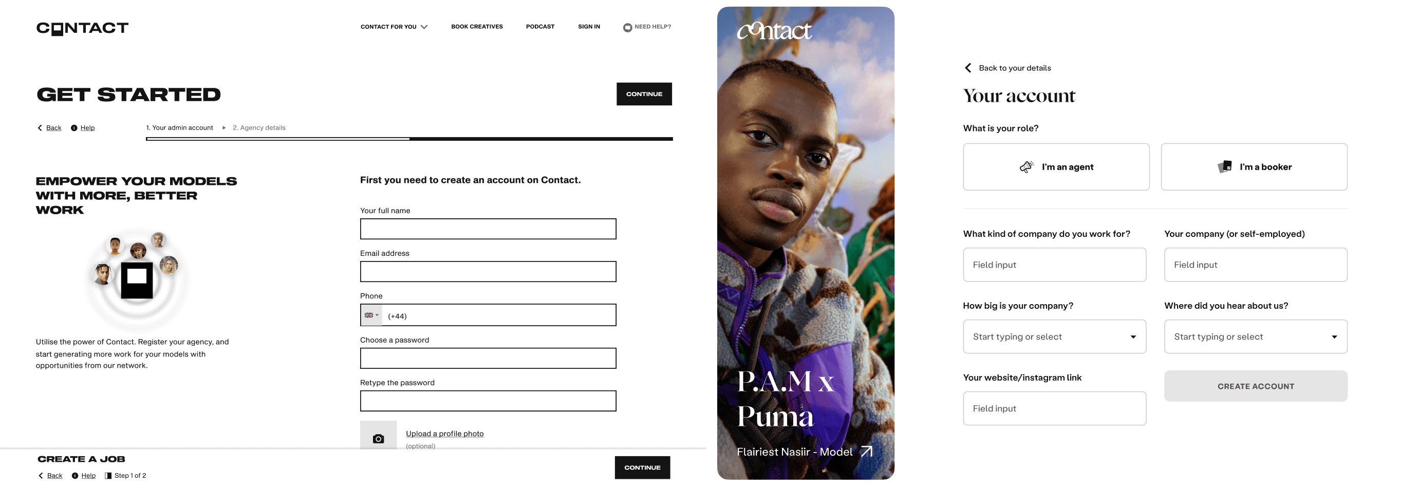
Before and after, Onboarding
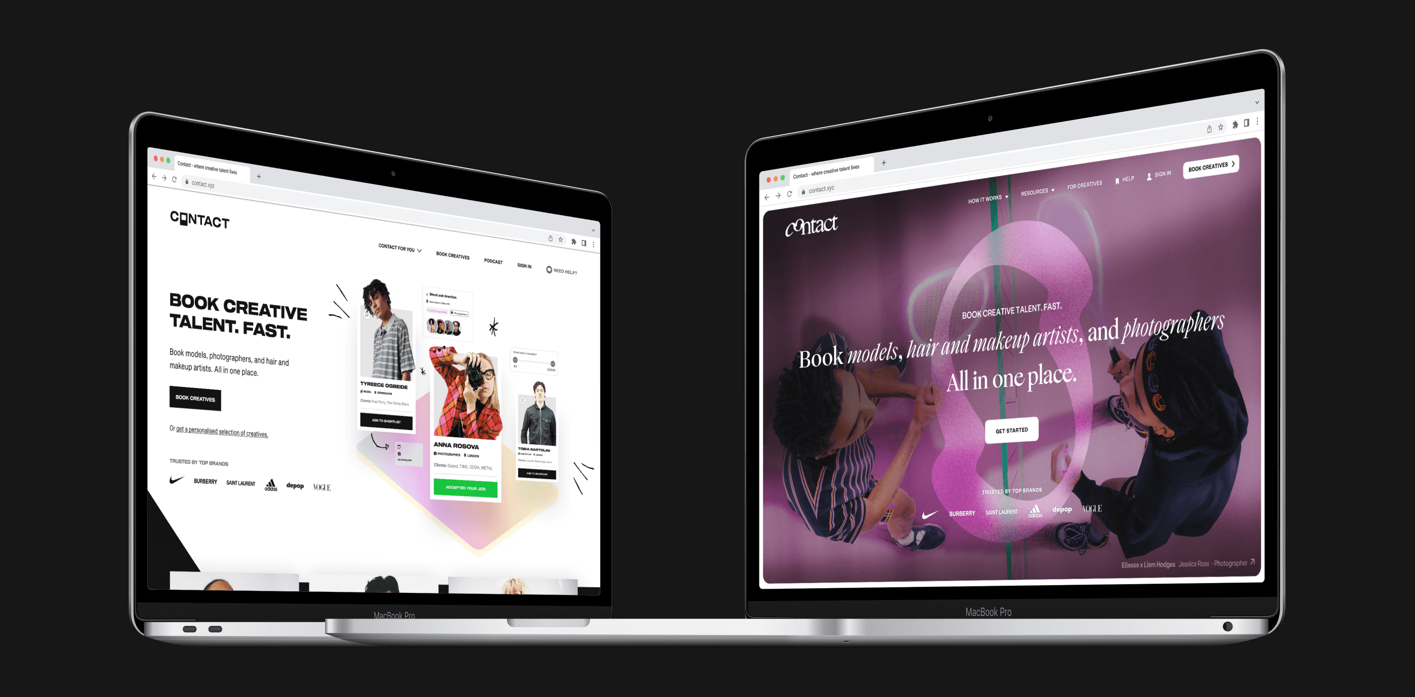
Before and after, landing page