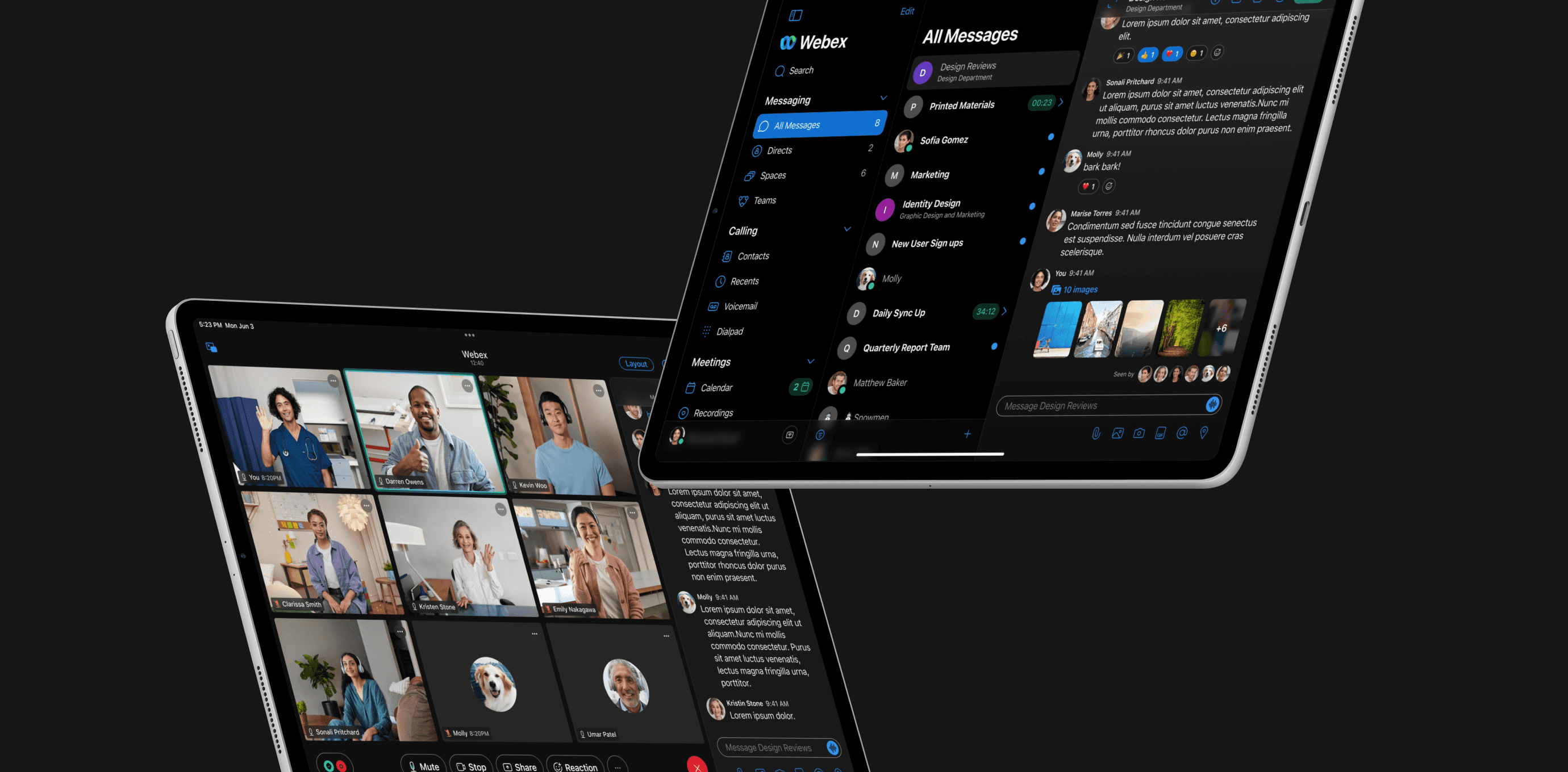
Webex for iPad
2021
UI/UX, Motion
Fueled
Cisco wanted to infuse a versatile, powerful collaboration tool with the familiarity of the native iPadOS experience.
Challenges
The task was to merge a suite of Webex’s collaboration apps into a single iPad app. We had to integrate Webex's newer features into a clean, intuitive interface that followed Apple’s HIG to a T. Webex had a number of design stakeholders, as well as Apple Product Designers, providing weekly feedback over an eight week engagement. We handled core product strategy, high fidelity prototypes and design system management for the project.
Mockups, chat
Prototype, conference calls
Process
We started by breaking down the existing app into sections, tackling each one during weekly meetings with Apple and daily scrums with Webex. We refined the design system, focusing on accessibility and branding by polishing icons, components, and colors. We emphasized navigation and hierarchy to improve calling, messaging, file management, and address books. User journey flows were created for efficient layouts, and details like the compose message component were carefully crafted. Weekly progress was presented in branded decks for Apple’s feedback. We concluded by delivering a Figma file with prototypes and a design system for Webex’s libraries.
Mockups, Smart Search
Outcomes
Working with tech giants like Cisco and Apple was an amazing learning experience. It’s safe to say I know Apple’s human interface guidelines for iPad like the back of my hand, and the launch of webex for iPad was a huge success, boasting 4.6/5 stars on Apple’s App Store from 800,000+ reviews.


